BLUE HILLS REBRAND
Overview / Context
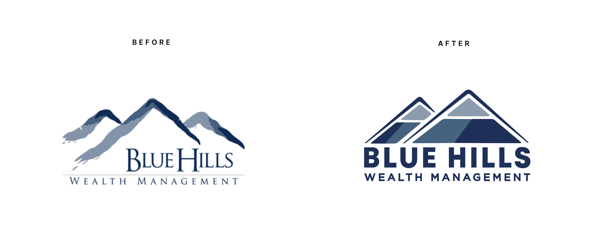
Working with Blue Hills Wealth Management was a game-changer. I led a comprehensive visual overhaul that modernized the brand while staying true to its roots. The outdated brush-stroke mountain logo was reimagined into a sleek, versatile emblem that preserved the same symbolism and colors, but with a refined, forward-thinking identity.
The result was a refreshed look that reflects BHWM’s innovation and commitment to excellence, while still feeling familiar and trustworthy to long-standing clients.
Before & After
The original logo relied on brush-stroke mountains that felt dated and lacked versatility across modern applications. In the redesign, I kept the same core symbolism and color family — the mountains that represent strength, stability, and heritage — but reimagined them as a sleek, geometric emblem.
The new design creates a more professional, trustworthy, and scalable mark that holds up across digital, print, and signage. By updating typography and refining the visual balance, the rebrand delivers a look that feels modern and forward-thinking while still staying true to Blue Hills’ identity.
Revamping Marketing Collateral:
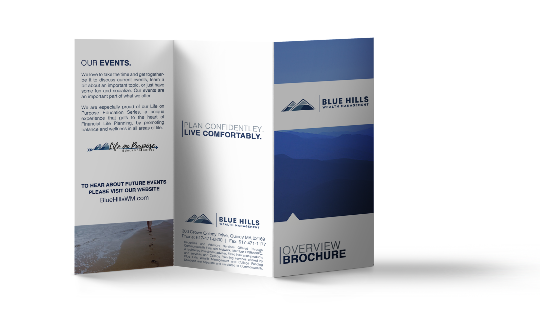
With the new branding in place, I redesigned all marketing assets: brochures, presentations, digital graphics, and the company website. Each piece was crafted to boost engagement and embody the core values of trust, innovation, and excellence.
The Impact:
The rebrand resonated with clients, boosting BHWM’s appeal and helping attract a younger, more tech-savvy audience while strengthening ties with loyal customers. The fresh look gave BHWM a modern, polished edge in a competitive market.
This project was a milestone in my career, highlighting my expertise in executing impactful design transformations that drive business success.


